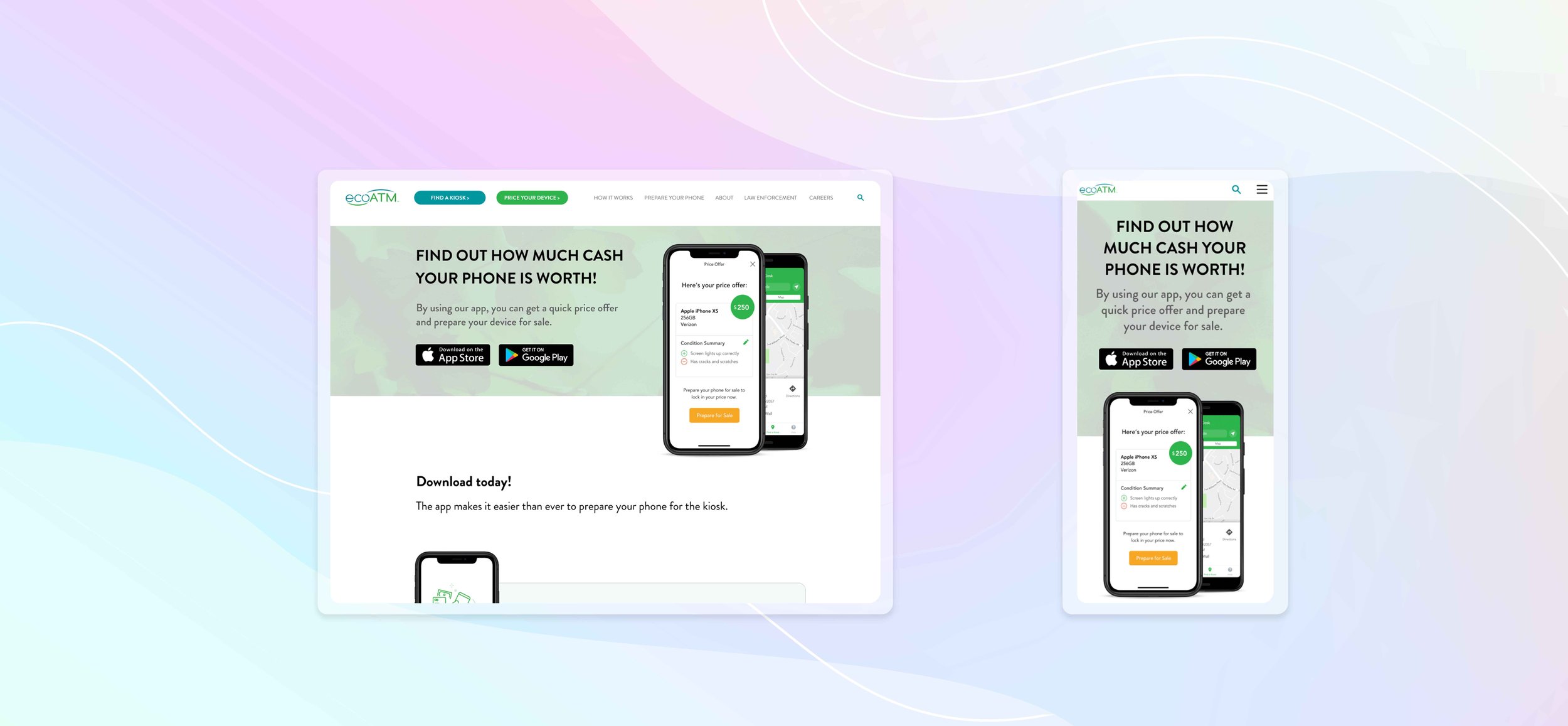
ecoATM Mobile App Landing Page
PROBLEM: ecoATM launched their mobile app, but customers lack awareness of its existence and how to download it.
GOAL: Develop a landing page showcasing the features offered by the mobile app, allowing downloads from the Apple App Store and Google Play.
LINKS: ecoATM mobile app webpage, mobile app Figma file
I developed initial designs using Adobe XD. I collaborated with my colleague, Robert McKinley, ecoATM’s Product Designer. I implemented his feedback, then built out final designs in Figma. We worked closely with the engineering team. The implementation of the design was done in PageFly, an app in Shopify.
Initial Design & Research
We began by identifying the key features required for the landing page. We then needed to highlight these key features and give compelling reasons for users to download the app. We incorporated the Apple App Store and Google Play download buttons. Navigate through the three blocks of my XD link to experience the page interaction. Robert McKinley’s comments were integral to refining the final designs.
Final Design
We decided to add color to the hero section to establish a more impactful initial presence. Implementing static text instead of blank blocks enhanced the user experience. I created colored tiles to display each feature. Below is my Figma design. We merged all the designs, for the final landing page.

